Wind Energy Utilization Dashboard: A Project to Learn Serverless Functions
Find it here
Introduction
The average person’s perception of the production factor of wind turbines is extremely exaggerated. I wanted to build a simple indicator in a couple of hours to be able to point to high-quality live data to dispel these beliefs. Mostly this was an excuse to learn about and implement serverless functions.
Objective
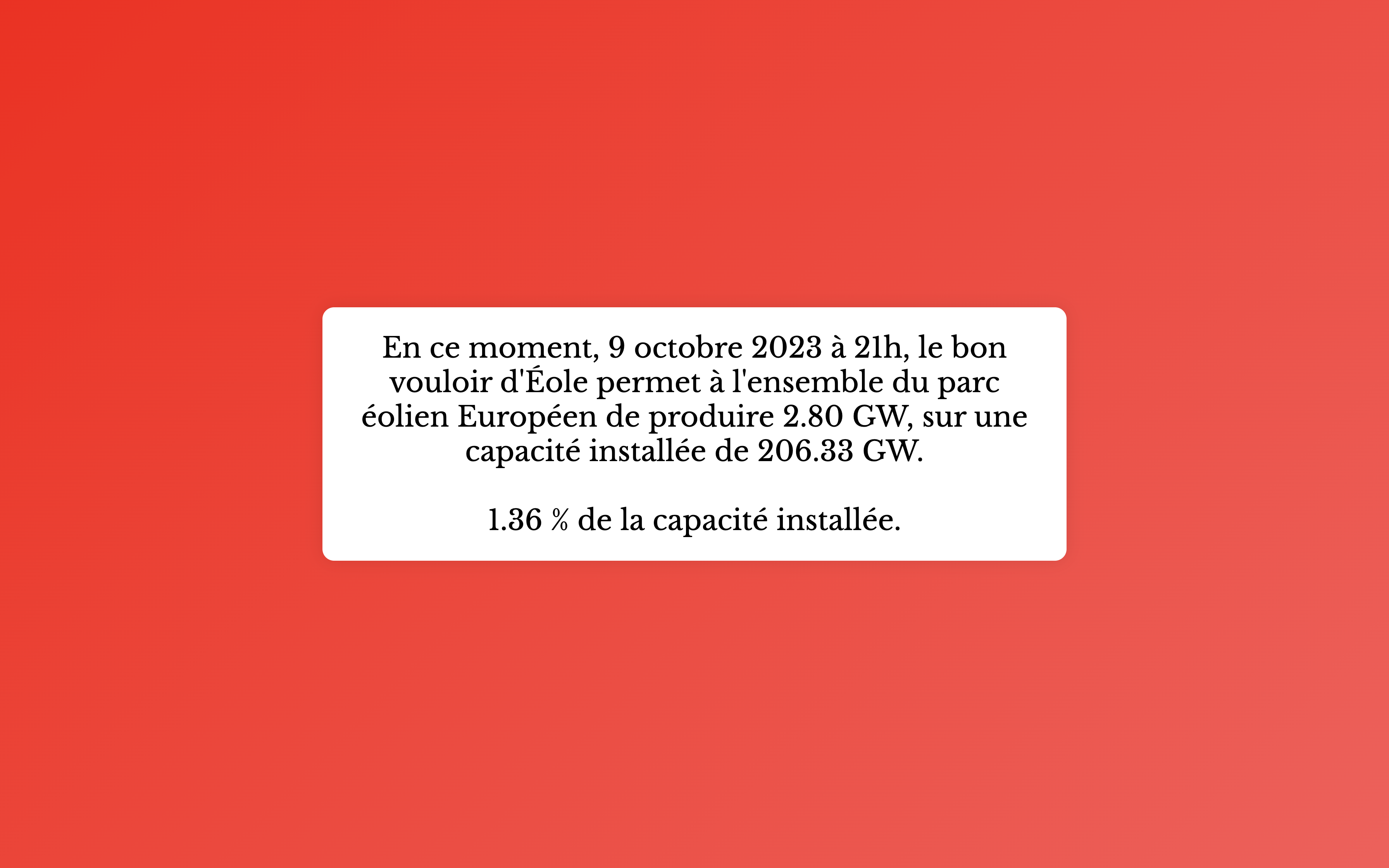
The page displays live wind energy utilization as a percentage of installed capacity. The color-coded background ranges from deep red for low utilization to deep green for high utilization. In fact this is probably overkill, as i’ve only ever seen it red.
Technologies and Learning Goals
- HTML, CSS, JavaScript: The website is extremely simple.
- Serverless Functions: The focus was to learn about serverless architecture. When the webpage is loaded, a serverless function is triggered to fetch live data.
How It Works
On page load, the JS calls a serverless function hosted on netlify, which itself calls the EnergyCharts API to get the necessary data. Then it converts it to a percentage of installed power and displays the absolute value and percentage.
Deployment
Hosted on Netlify. Configuration is in netlify.toml.
Project Structure
.
├── app.js               ### Main JS for data fetch and display
├── index.html           ### Main HTML
├── netlify              ### Netlify configurations
│   └── functions
│       └── fetchEnergyData.js   ### Serverless function for data fetch
├── netlify.toml         ### Netlify deployment config
├── package.json         ### Dependencies and metadata
└── styles.css           ### Webpage styles
Acknowledgments
- Energy Charts team for the wind energy data API.
- Netlify for hosting and enabling serverless functions.
Conclusion
This quick project served two purposes: resolving a debate and offering a hands-on experience with serverless functions. The dashboard effectively visualizes live wind energy utilization data in Europe.