Electricity Sources Dashboard for Reunion Island
Find it here
In France, RTE, (Réseau de Transport d’Electricité, the company in charge of the electrical grid) has a website which displays a graph of electricity generation by source, as well as one of the CO2 intensity of electricity. However DOMs (overseas territories) do not have the same dashboards available. The raw data still is, through EDF’s open data portals - one per DOM, here’s the one for Reunion Island. Using this data, I built a similar dashboard to the mainland one. I have also adapted it for other DOMs, although I have not released these yet. They are interesting to compare, because they have different blends of electricity production sources.
I believe this is an interesting resource to have, and I used it as an excuse to learn to use streamlit to build dashboards.
Technologies Used
- Streamlit: For rapid prototyping and deployment.
- Python: For data processing and real-time updates.
- APIs: For fetching real-time data.
Features
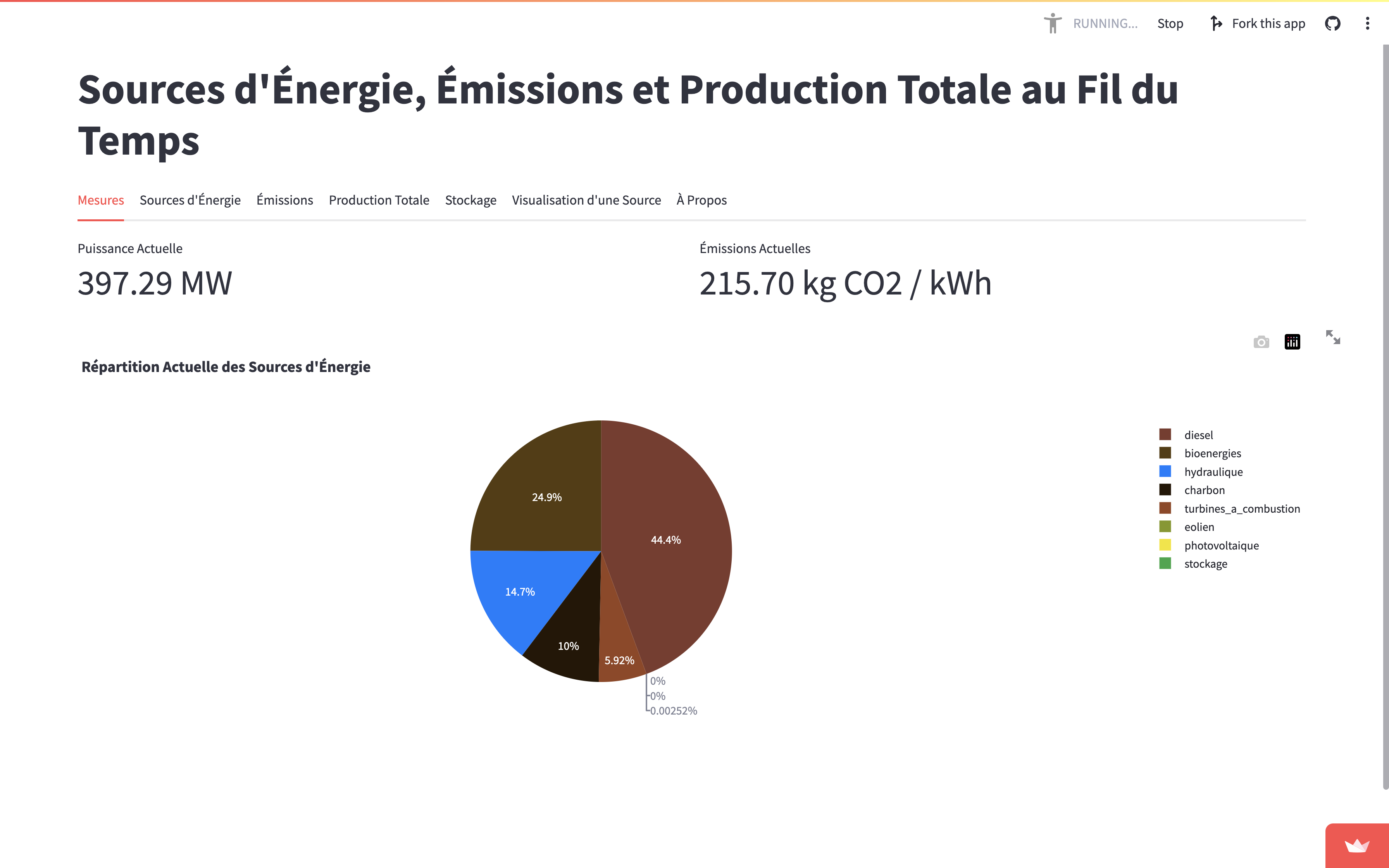
- Real-Time Metrics: Display of current power output and CO2 emissions.
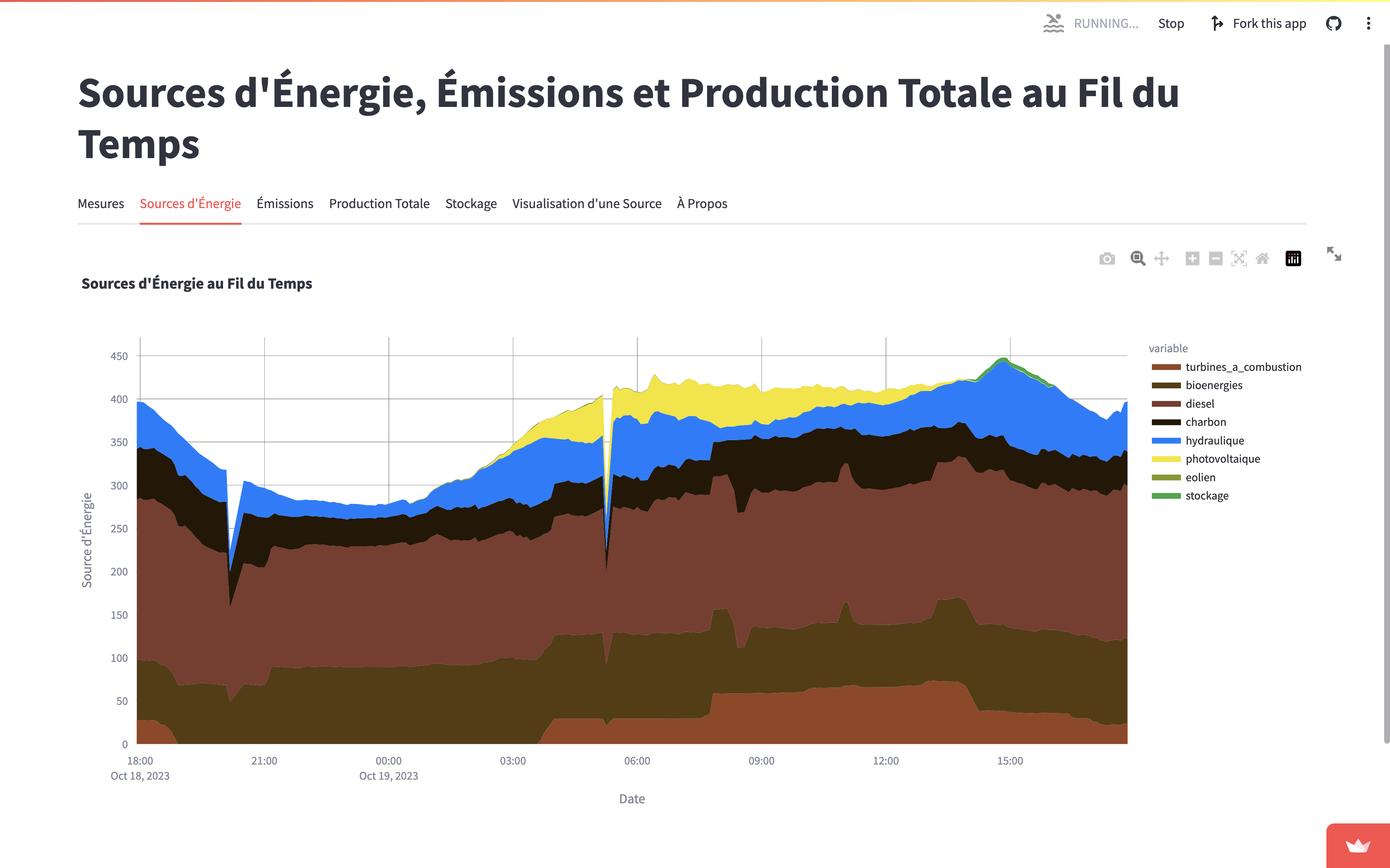
- Energy Sources: Visual breakdown of different energy contributions.
- Emissions Tracking: Time-series data of greenhouse gas emissions.
- Total Production: Overview of total electricity production over time.
- Energy Storage: Capacity and usage data for stored energy.
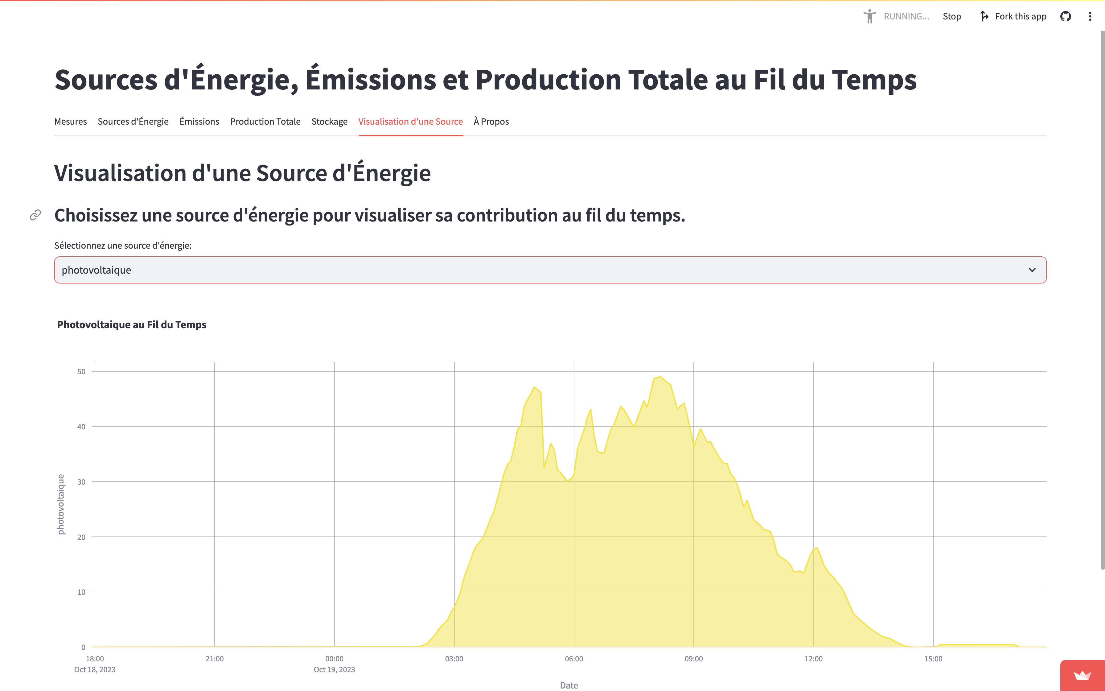
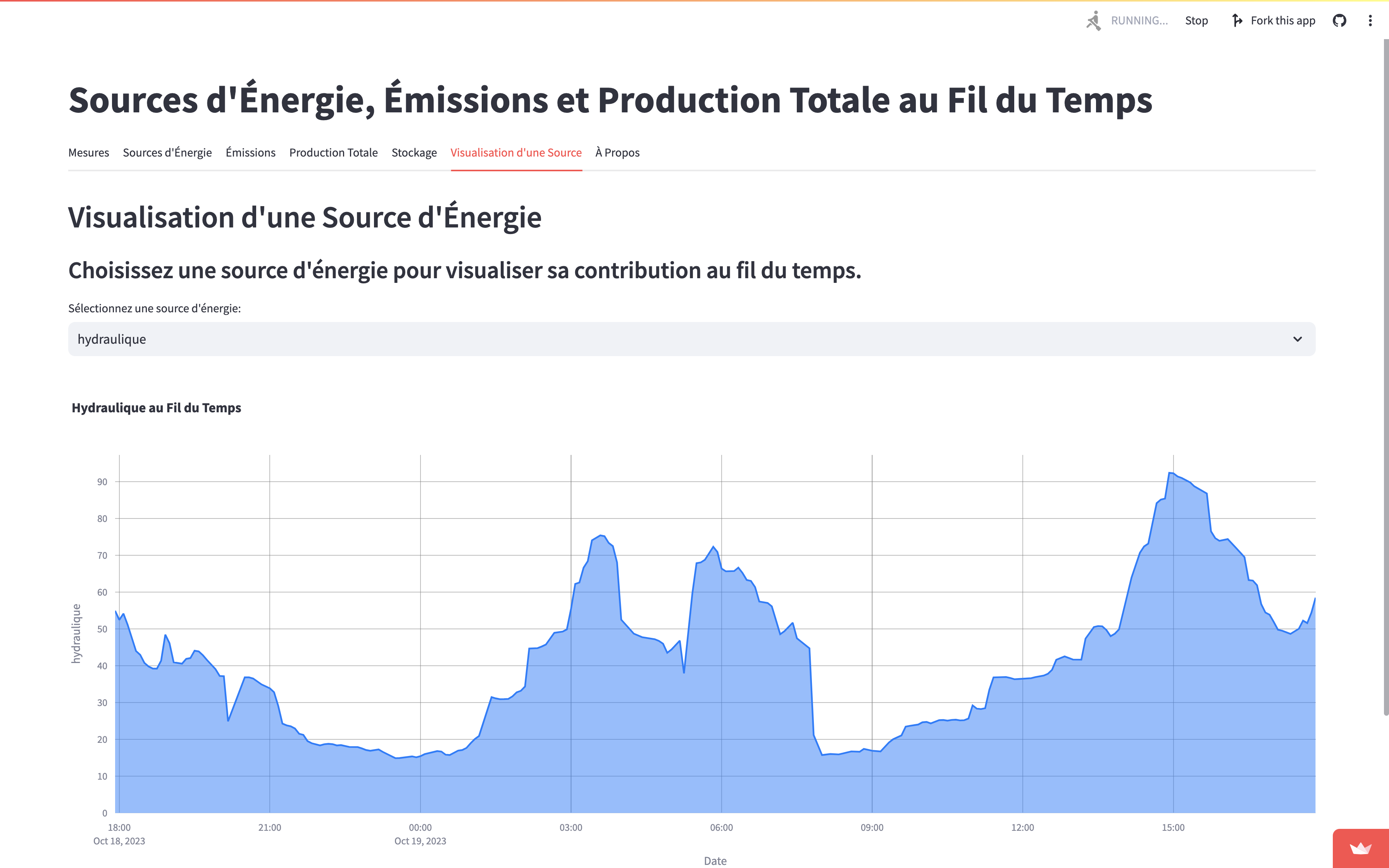
- Single Source Visualization: Deep-dive into the data of individual energy sources.
How It Works
Data Collection
All of the data comes from the EDF opendata api, specifically the Production d’électricité par filière en temps réel. There are also some constant values for CO2 emissions per source per kWh.
Data Processing
- Aggregation: Data from multiple sources is aggregated to a single data frame.
- Normalization: Data is normalized for consistent visualization.
- Time Series Construction: Time-based indexing is performed for tracking changes over time.
Visualization
- A Pie Chart : For the ‘Measures’ tab, to show current energy mix.
- Stacked Area Plots : For ‘Energy Sources’, and ‘Emissions’, to visualize contributions over time.

- Area Graphs : For ‘Solar’ and ‘Hydro’, to track changes in greenhouse gas emissions and storage capacity.
Updates
The dashboard updates every 5 minutes, ensuring the information is current.
Lessons Learned
- API Limitations: Not all APIs are well-built. Some update at random intervals, like they get dumps of data from time to time instead of every five minutes. You need to align timestamps and over-request to not miss anything.
- Streamlit’s Flexibility: Learned how to implement custom features to enrich visualizations. I think they’re neat.
- Data Accuracy: Ensured the data was accurate and up-to-date, as it serves an educational purpose and could influence policy.
Conclusion
I hope this project serves as an insightful resource for understanding real-time dynamics of electricity production and its environmental impact. Streamlit proved to be an interesting tool for this project, allowing rapid development with guardrails for usability, which come at the price of speed, liberty, and flexibility. I hope this dashboard can be useful, I hope to be able to improve it over time. Do not hesitate to provide critique !